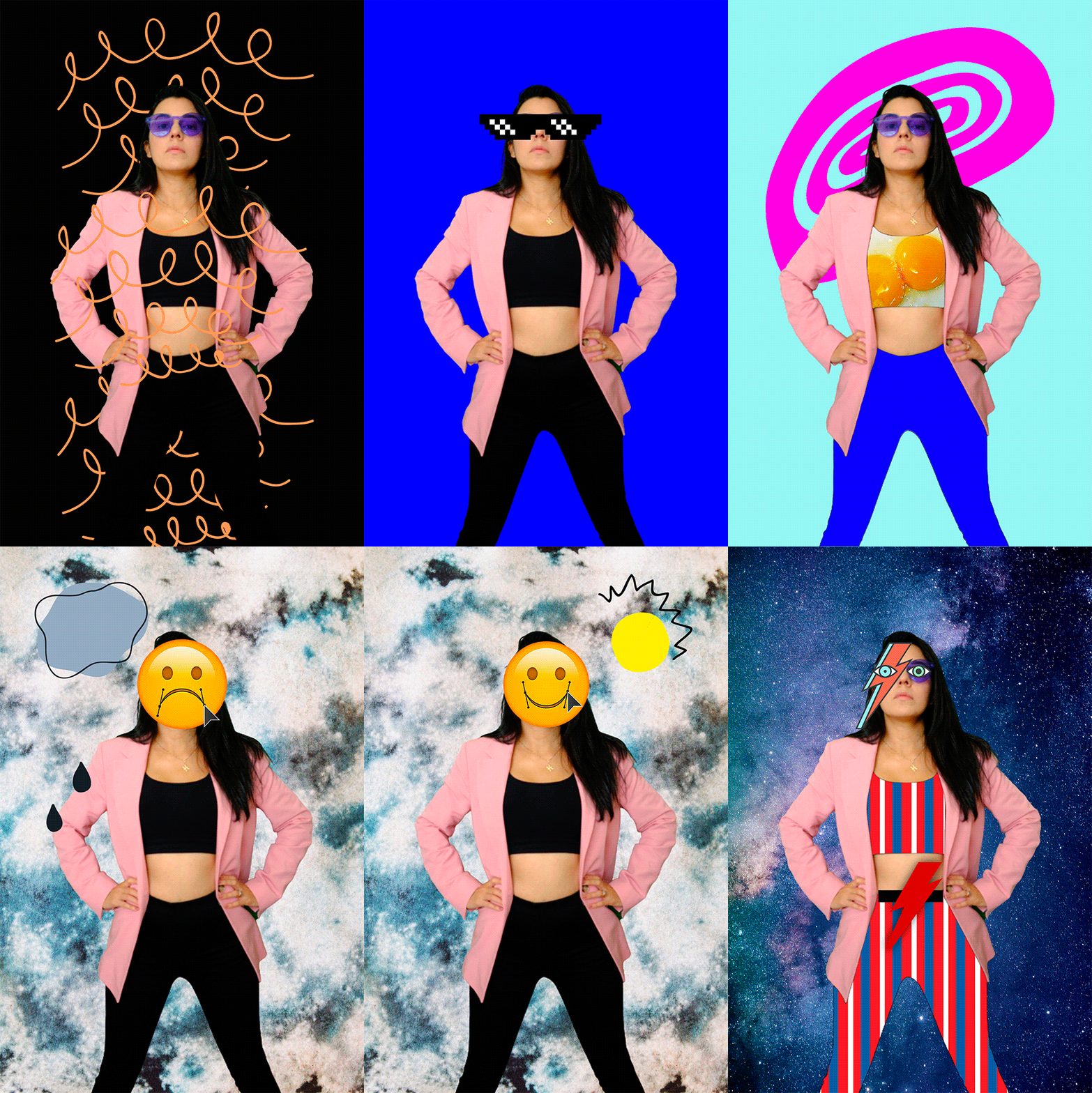
Designer | Artist based in Florida,USA. My work in incredible diverse. I like to combine traditional graphic design elements with color, art and styling to create unique visual crafts for brands and their print or digital experiences. I ❤︎ moving the boundaries of design and art to create content for B2B and B2C audiences.
SERVICES
Branding development
Editorial design
Color consulting
Production design
Motion graphics
Audiovisual content
Art direction
Web design
NewBeauty Magazine
Cinepolis Colombia
Eternit LATAM
Universidad del Rosario
FEDCO Colombia
Montessori British School
El Osceola Star Newspaper
Museo de Arte Contemporáneo de Bogotá
NOTABLE PROJECTS
2018 ━ Creative Direction for the animated short animation “El Sapo Calabazo” IDARTES – Colombia.
Artist Grands
2017 ━ ARTIST IN RESIDENCE
▹ Ministry of Culture of Colombia & Conseil des Arts et des Letres du Quebec (CALQ) – Montreal Canada.
▹ Laboratorio Oaxaca – Mexico.
▹ Fundación Intermundos – Palomino – Colombia.
2015 ━ ARTIST IN RESIDENCE
▹Ministry of Culture of Colombia & Eastern Bloc Montreal – Canada.
2013 ━ LAPSODY 2013 4th Festival for Live Art and Performance Studies University of the Arts Helsinki Theatre Academy – Finland.


